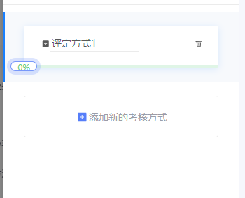
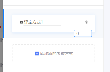
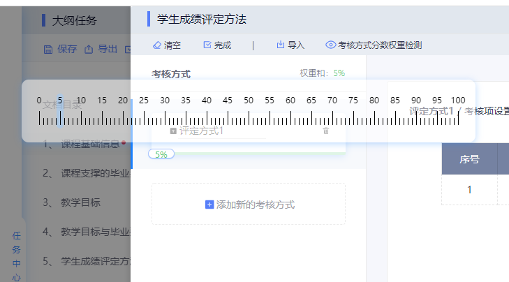
效果图
index.vue 父组件
html
<template>
	<div class='mode-box-content'>
		<ul class='modeList' ref='modeList'>
		  <transition-group type="transition" name="flip-list">
			<li class='mode-item' v-for='(item, index) in modeList' :key='index+1' :id='"mode" + index' :class='{active:item.active}' @click='select(item)'>
			  <div class='mode-item-box'>
				<div class='mode-item-content'>
				  <span title="修改">
					  <a-icon type="edit" @click.stop='editName(item,index)'/>
					</span>
				  <div class='mode-item-input-box'>
					<input :id='"nameInput" + index' type='text' v-model='item.name' placeholder='请输入开合方式' :readonly='!item.edit' @blur='editNameConfirm(item,index)'>
				  </div>
				  <span title="删除">
					  <a-icon type="delete" @click.stop='removeModeItem(index)'/>
					</span>
				</div>
				<slider class='mode-item-slider' :value='item.weights' :max-value='item.maxWeights' :rulerKey='index' :course='item' @sliderChange='sliderChange' @sliderAfterChange='sliderAfterChange'></slider>
			  </div>
			</li>
		  </transition-group>
		  <transition>
			<li class='mode-item-add'  :key='-1' ref='addMode'>
			  <div class='mode-item-box' @click='addMode'>
				<a-icon type="plus" style="color: #9b9da8;"/>
				添加新的方式
			  </div>
			</li>
		  </transition>
		</ul>
  </div>
</template>
js
<script>
import 'animate.css'
import slider from '@/components/slider'
export default{
		components: {
			slider
		},
		data(){
			return{
				modeList:[{
					id: 0,
					name: "评定方式1",
					weights: 0,
					maxWeights:100,
					edit: false,
					active: true,
					assessmentItems: [{
						assessmentItem: 1,
						fullScore: 1
					},]
				}],
			}
		},
		computed: {
			weights() {
			  let weights = 0;
			  this.modeList.forEach(item => {
				weights += item.weights
			  })
			  return weights
			},
		},
		mounted() {

		},

		watch: {
			visible(a) {
			  if(a) {
				this.$nextTick(() => {
				  this.$refs.modeList.style.height = this.modeList.length * 100 + 'px'
				})
			  }
			}
		  },

		methods:{
			// 权重改变的回调
			sliderChange(e) {
			  this.modeList.forEach(item => {
				if(item.id === e.course.id) {
				  item.weights = e.value
				}
			  });
			},

			// 权重更改完成的回调
			sliderAfterChange(e) {
			  // console.log(this.weights)
			  let maxWeights = 100 - (eval(this.modeList.map(item => item.weights).join("+")) || 0);
			  // console.log(maxWeights)
			  this.modeList.forEach(item => {
				if(item.id !== e.course.id) {
				 item.maxWeights = (maxWeights + item.weights) > 0 ? maxWeights + item.weights : 0
				  // console.log(item)
				}
			  })
			  // console.log(this.modeList)
			},

			// 添加考核方式
			addMode() {
			  this.modeList.push({
				id: this.modeList.length,
				name: "未命名",
				weights: 0,
				maxWeights: 100 - this.weights,
				edit: false,
				active:false,
				assessmentItems: [
				  {
					assessmentItem: null,
					fullScore: 0
				  },
				]
			  })
			  this.$refs.modeList.style.height = this.modeList.length * 100 + 'px'
			  this.$nextTick(() => {
				let modeItem = document.querySelector("#mode" + (this.modeList.length - 1))
				modeItem.setAttribute("class", "mode-item animate__animated animate__pulse");
				setTimeout( ()=>{
				  let active = modeItem.getAttribute('class').indexOf("active") === -1 ? '' : 'active'
				  modeItem.setAttribute("class", "mode-item " + active);
				},1200)
			  });
			},

			// 修改考核方式名称
			editName(e,i) {
			  e.edit = true;
			  document.querySelector("#nameInput" + i).focus()
			},

			// 修改考核方式名称完成
			editNameConfirm(e,i) {
			  e.edit = false
			},

			// 删除考核方式
			removeModeItem(i) {
			  this.modeList.splice(i,1)
			  this.$refs.modeList.style.height = this.modeList.length * 100 + 'px'
			},

			// 选择考核方式
			select(e) {
			  this.modeList.forEach(item => {
				item.active = false
			  })
			  e.active = true
			},
		},
	}
</script>
css
<style  lang='less' scoped>
.mode-box-content{
      overflow-y: auto;
      height: calc(100% - 53px);
      position: relative;
      &::-webkit-scrollbar{
        width: 4px;
        height: 1px;
        background-color: transparent;
      }
      /*定义滚动条轨道 内阴影+圆角*/
      &::-webkit-scrollbar-track{
        width: 0;
        border-radius: 0;
        background-color: transparent;
      }
      /*定义滑块 内阴影+圆角*/
      &::-webkit-scrollbar-thumb{
        border-radius: 4px;
        background-color: #E1E7EE;
      }
      .modeList{
        transition:height .5s;
        position: relative;
        box-sizing: content-box;
        padding:  10px 0 100px 0;
        .mode-item{
          padding: 20px 30px;
          position: relative;
          .mode-item-box{
            width: 278px;
            height: 60px;
            box-shadow: 0 2px 10px 0 rgba(25, 128, 255, 0.15);
            border-radius: 4px;
            background: #FFFFFF;
            cursor: pointer;
            position: relative;
            margin: auto;
            box-sizing: border-box;
          }
          &.active{
            background-color: #F7F9FC;
            &:before{
              content: "";
              position: absolute;
              left: 0;
              top: 0;
              width: 3px;
              height: 100%;
              background-color: #1980FF;
            }
          }
          .mode-item-content{
            padding: 0 21px 0 24px;
            display: flex;
            height: calc(100% - 10px);
            align-items: center;
            justify-content: space-between;
            .mode-item-input-box{
              flex: 1;
              input{
                width: 126px;
              }
            }
          }
          .mode-item-slider{
            position: absolute;
            left: 0;
            bottom: 0;
            width: 100%;
          }
        }
        .mode-item-add{
		  cursor: pointer;
          padding: 20px 30px;
          position: absolute;
          bottom: 0;
          left: 0;
          right: 0;
          margin: auto;
          .mode-item-box{
            width: 278px;
            height: 60px;
            background: #FFFFFF;
            border: 1px dashed #EBEBEB;
            border-radius: 4px;
            font-size: 14px;
            color: #9B9DA8;
            display: flex;
            align-items: center;
            justify-content: center;
          }
          .anticon{
            color: blue;
            font-size: 20px;
          }
        }
      }

    }

@keyframes show {
  from {height: 0}
  to {height: 45px}
}
@keyframes hide {
  from {height: 45px}
  to {height: 0}
}

</style>
slider.vue 可拖拽的尺子 子组件
html
<template>
  <div class='slider' ref='slider'>
    <!-- 可拖拽的尺子 -->
    <a-popover v-model="isShowRuler" overlayClassName="popover-ruler" trigger="">
      <!-- 刻度尺 -->
      <div class="movable-ruler" slot="content" :data-rulerKey='rulerKey'>
        <span class="moving-scale" :style="{left: left + 'px'}"></span>
        <span v-for="(item, i) in rulerScales" :key="item">
          <span
            class="scale"
            :style="{
              marginRight: i === (rulerScales.length - 1) ? '0px' : '5px',
              background: item <= maxValue ? '#000' : '#FE7184',
              color: item <= maxValue ? '#000' : '#FE7184'}">
            <span>{{item}}</span>
          </span>
          <template v-if="i !== (rulerScales.length - 1)">
            <span :style="{background: (item +1) <= maxValue ? '#000' : '#FE7184'}" class="s-scale"></span>
            <span :style="{background: (item + 2) <= maxValue ? '#000' : '#FE7184'}" class="s-scale"></span>
            <span :style="{background: (item + 3) <= maxValue ? '#000' : '#FE7184'}" class="s-scale"></span>
            <span :style="{background: (item + 4) <= maxValue ? '#000' : '#FE7184'}" class="s-scale"></span>
          </template>
        </span>
      </div>
      <!-- 修改权重输入框 -->
      <a-input-number
        v-if="isEditPercent"
        style="width:60px;background:#fff !important;border:1px solid #4799FF !important;position:absolute;bottom:-15px;right:10px;"
        size="small"
        v-model="percentage"
        :min="0"
        :max="100"
        @pressEnter="sliderInputBlur()"
        @blur="sliderInputBlur()"
        :formatter="value => `${value}`"
        :parser="parser"
        autoFocus
      />
      <a-slider
        class='rulerSlider'
        v-if="!isEditPercent && !isDragging"
        :tipFormatter="null"
        :max="100"
        style="width:100%;height:4px;"
        v-model="percentage"
        @change="sliderChange()"
        @afterChange="sliderAfterChange"
      />
    </a-popover>
  </div>
</template>
js
<script>
	export default ({
	  name: 'slider',
	  props:{
		course: {
		  type: Object,
		  default: {}
		},
		maxValue: {
		  type: Number,
		  default: 50,
		},
		value: {
		  type: Number,
		  default: 0,
		},
		rulerKey: {
		  type: Number,
		  default: 0,
		},
	  },
	  data() {
		return {
		  isEditPercent: false,
		  isDragging: false,
		  isShowRuler: true,
		  rulerScales: [0,5,10,15,20,25,30,35,40,45,50,55,60,65,70,75,80,85,90,95,100],
		  percentage: 0,
		  left: 0
		}
	  },
	  watch: {
		maxValue() {
		  this.setSilderInValue()
		}
	  },
	  mounted() {
		this.percentage = this.value
		this.setSilderInValue()
		this.$nextTick(() => {
		  this.sliderRegistrationEvent()
		})
	  },
	  methods: {
		// 输入框失焦
		sliderInputBlur() {
		  this.isEditPercent = false
		  this.$nextTick(() => {
			this.setSilderInValue()
			this.sliderRegistrationEvent()
			this.$emit("sliderChange",{value:this.percentage,course:this.course})
		  })
		},
		parser(value) {
		  value = value.replace(/^0+(?=\d)|\D|^[2-9]0(?=[0-9])|^[1-9]+?(?=[1-9][0-9])|^10(?=[1-9])/, '')
		  value = value > this.maxValue ? this.maxValue : value
		  return value
		},
		// 拖拽更改数据
		sliderChange(e) {
		  let rulers = document.querySelectorAll('.movable-ruler')
		  rulers.forEach(item => {
			if(this.rulerKey === Number(item.dataset.rulerkey)) {
			  item.style.display = 'block'
			}
		  })
		  this.left = 20 + this.percentage * 6
		  this.setSilderInValue()
		  this.$emit("sliderChange",{value:this.percentage,course:this.course})
		},
		// 拖拽完成后隐藏尺子
		sliderAfterChange() {
		  let rulers = document.querySelectorAll('.movable-ruler')
		  rulers.forEach(item => {
			item.style.display = 'none'
		  })
		  this.$emit("sliderAfterChange",{value:this.percentage,course:this.course})
		},
		// 给slider的移动圆点注册双击编辑事件
		sliderRegistrationEvent () {
		  let handles = this.$refs.slider.querySelector('.ant-slider-handle')
		  handles.ondblclick = () => {
			this.isEditPercent = true
		  }
		},
		// 为滑动输入条中添加值
		setSilderInValue() {
		  this.$nextTick(() => {
			const point = this.$refs.slider.querySelector(".ant-slider-handle");
			// console.log(this.percentage)
			// console.log(this.maxValue)
			if(this.percentage > this.maxValue) {
			  point.style.color = '#FE5F75'
			}else {
			  point.style.color = '#60CF83'

			}
			point.innerText = this.percentage + '%'
		  })
		},
	  }
	})
</script>
css
<style lang='less' scoped>
	.ant-popover-open {
	  background: transparent !important;
	  border: none !important;
	  box-shadow: none !important;
	}
</style>
<style lang='less'>
	.popover-ruler {
	  .ant-popover-arrow {
		display: none;
	  }
	  .ant-popover-inner {
		border-radius: 10px;
		box-shadow: none;
		background-color: transparent;
	  }
	  .ant-popover-inner-content {
		padding: 0;
	  }
	  /* 拖拽刻度尺 */
	  .movable-ruler {
		display: none;
		width: 650px;
		padding: 45px 0 20px;
		text-align: center;
		border-radius: 10px;
		background: rgba(255, 255, 255, .5);
		box-shadow: 0px 2px 10px 0px rgba(25, 128, 255, 0.3);
		/*  高亮显示的刻度 */
		.moving-scale {
		  position: absolute;
		  left: 20px;
		  top: 20px;
		  display: inline-block;
		  width: 10px;
		  height: 50px;
		  border-radius: 10px;
		  background: rgba(149,202,255,0.5);
		}
		.scale {
		  position: relative;
		  display: inline-block;
		  width: 1px;
		  height: 20px;
		  span {
			position: absolute;
			top: -25px;
			left: 50%;
			transform: translate(-50%, 0);
			font-size: 12px;
		  }
		}
		.s-scale {
		  display: inline-block;
		  width: 1px;
		  height: 10px;
		  margin-right: 5px;
		}
	  }

	}

	.slider {
	  .ant-slider{
		margin: 0;
		padding: 0;
	  }
	  .ant-slider:hover .ant-slider-track {
		background-color: #9FE3B5;
	  }
	  .ant-slider:hover .ant-slider-rail {
		background-color: #DFF5E6;
	  }
	  .ant-slider-rail {
		background-color: #DFF5E6;
	  }
	  .ant-slider-track {
		background-color: #9FE3B5;
		border-radius: 0 0 0 2px;
	  }
	  .ant-slider-rail {
		border-radius: 0 0 2px 2px;
	  }
	  .ant-slider-handle {
		z-index: 1;
		width: 38px;
		height: 14px;
		background: #fff;
		border: 1px solid #DFF5E6;
		box-shadow: 0px 1px 1px 0px rgba(25, 128, 255, 0.1);
		border-radius: 7px;
		line-height: 14px;
		text-align: center;
		color: #60CF83;
		font-size: 12px;
		&:hover {
		  color: #308CFF;
		  border-color: #308CFF;
		  box-shadow: 0px 1px 1px 0px rgba(25, 128, 255, 0.3);
		}
	  }
	}

</style>